Unused Brands
ROLE
Branding
Art Direction
CLIENT
Misc. Clients
DATE
2022-2025
As any branding process goes, there will always be logos that fall to the wayside. Many of the following logos were not chosen due to better options, or simply experimenting with different names. Below are a few of my favorites.
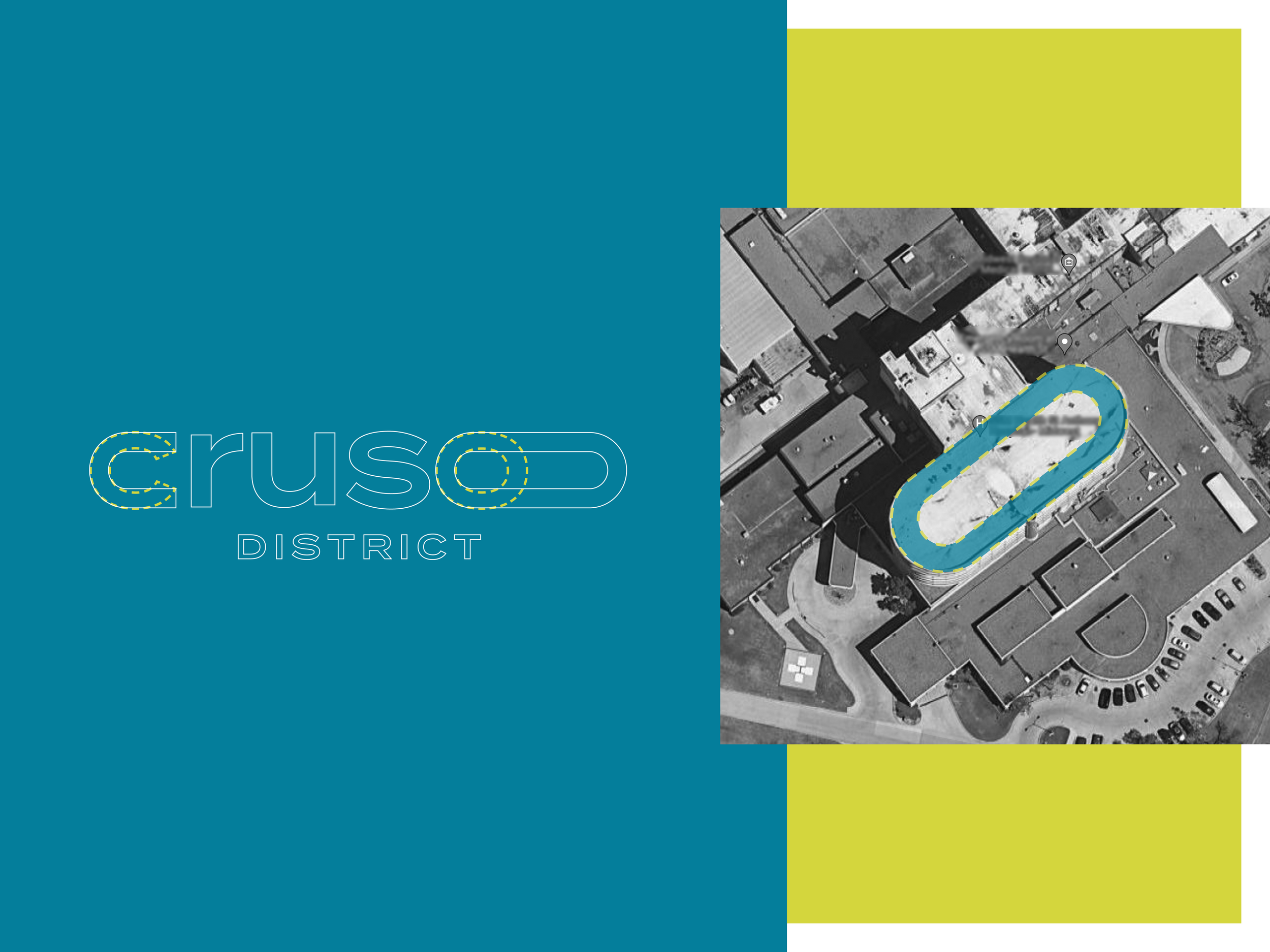
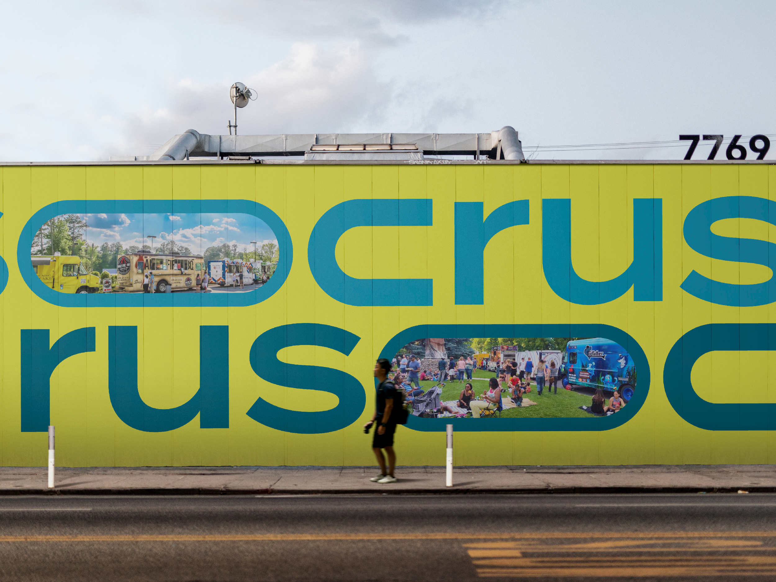
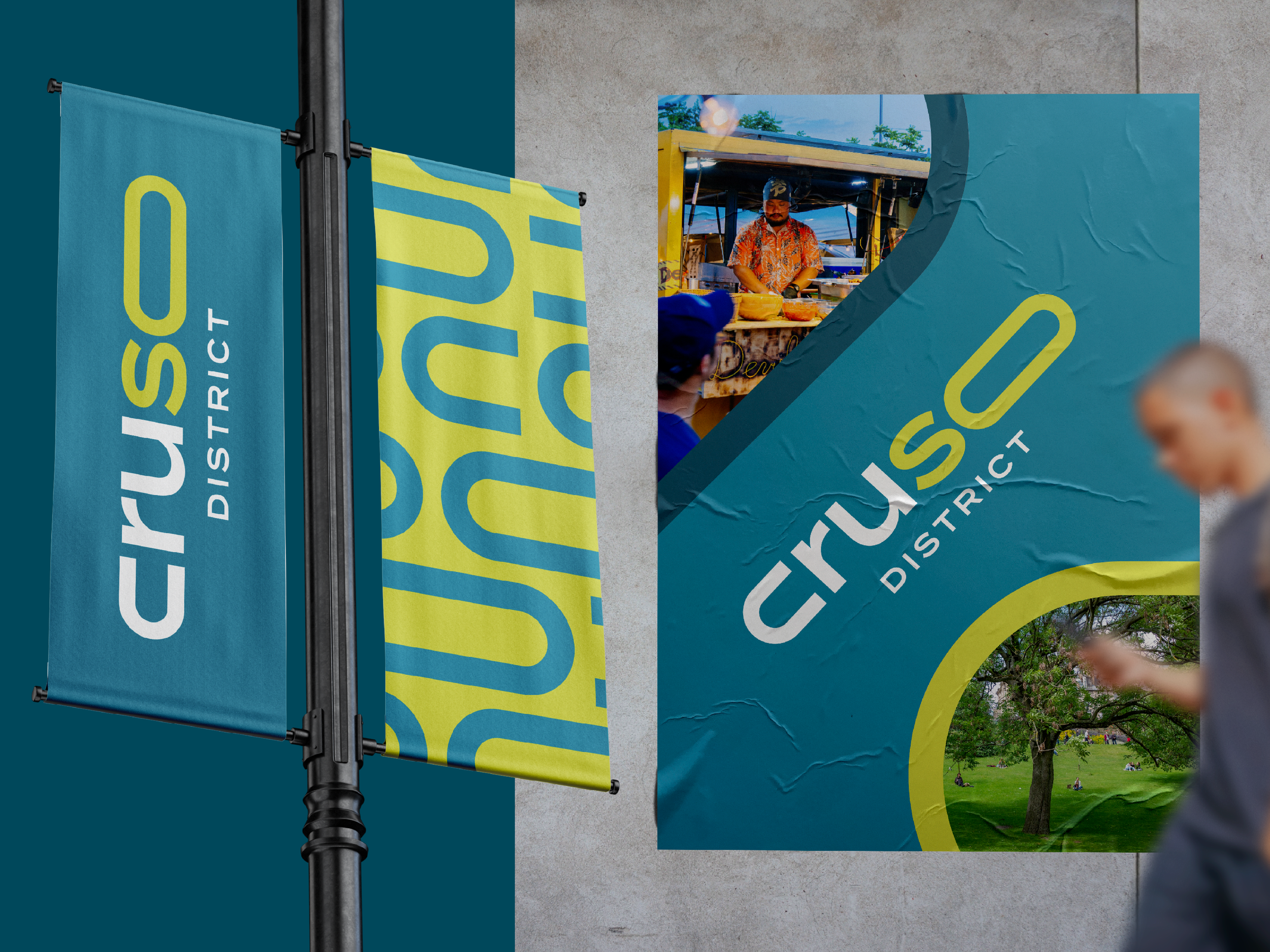
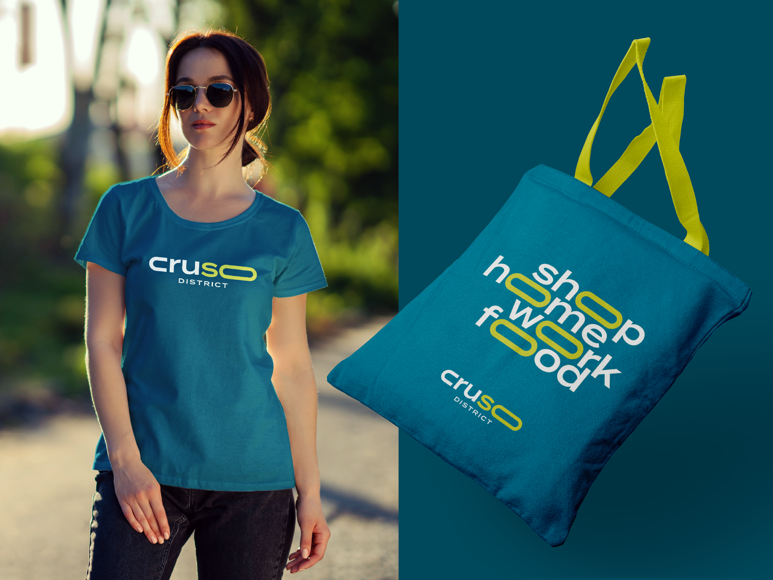
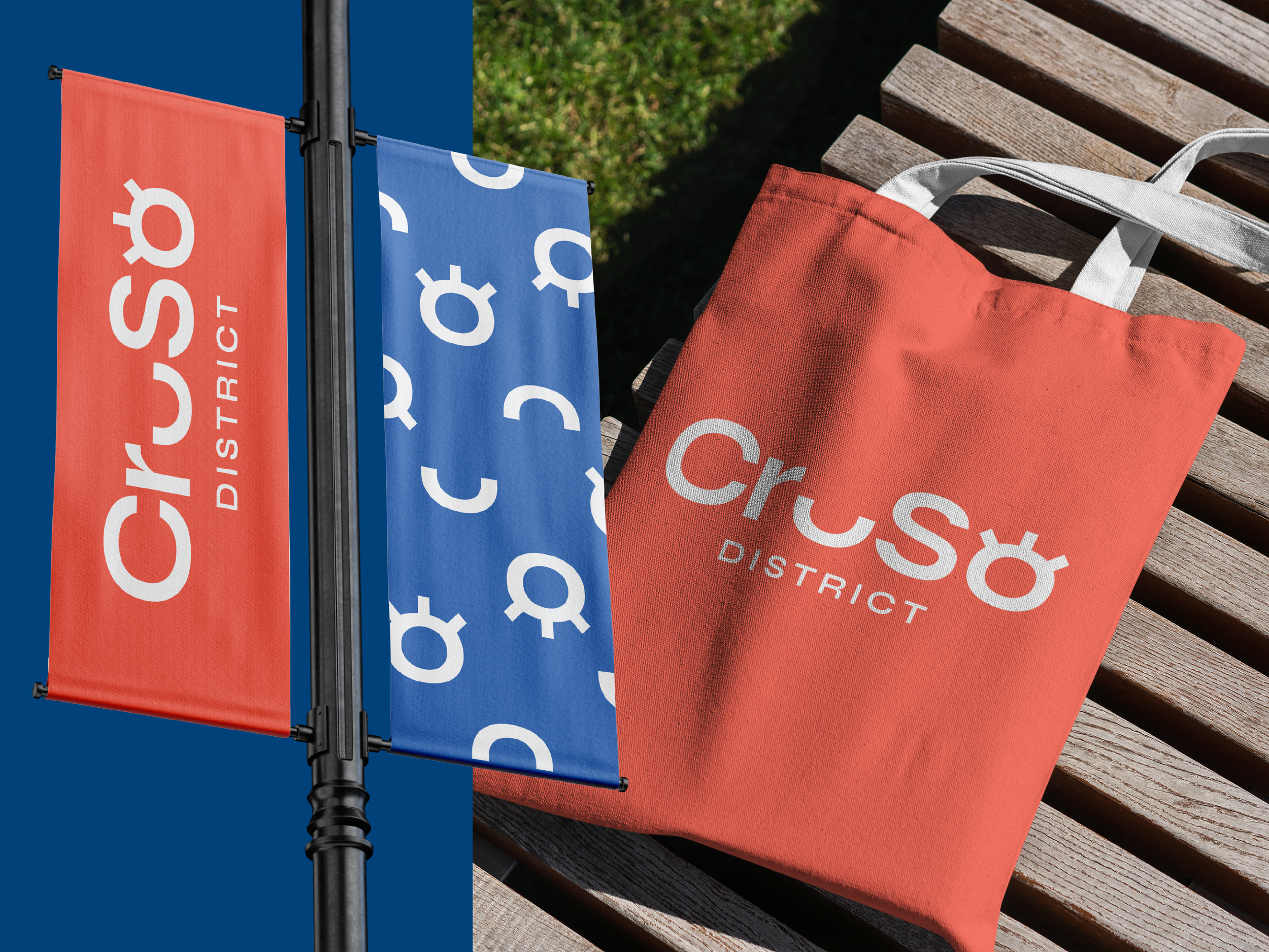
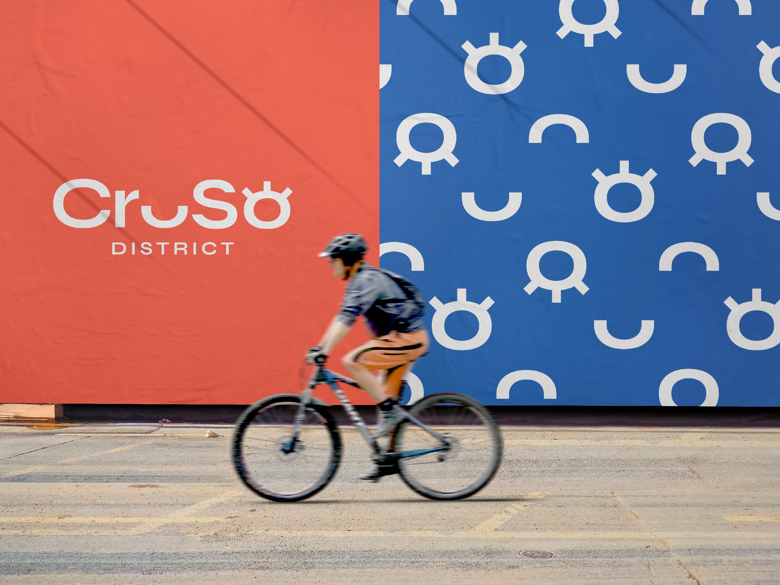
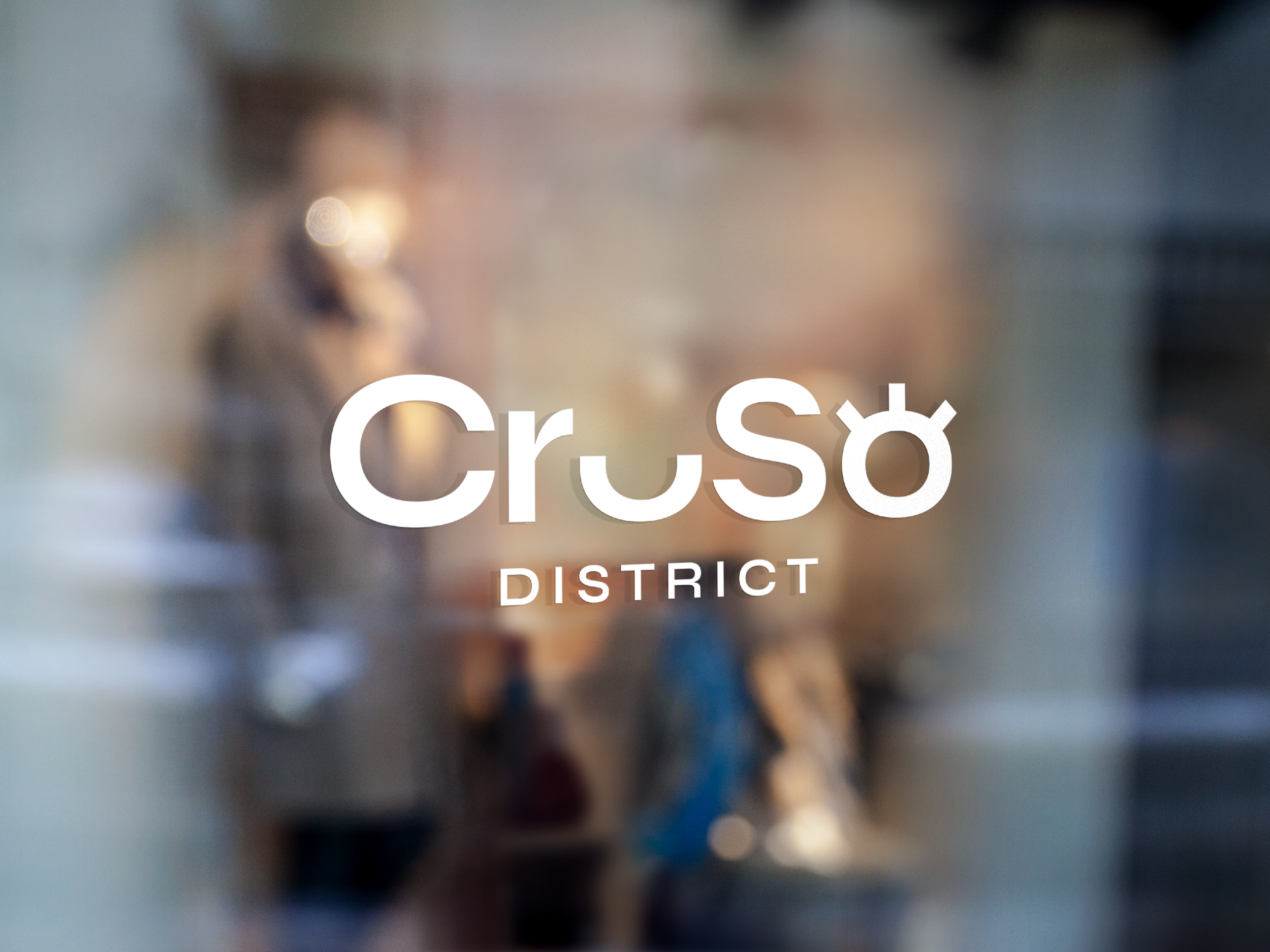
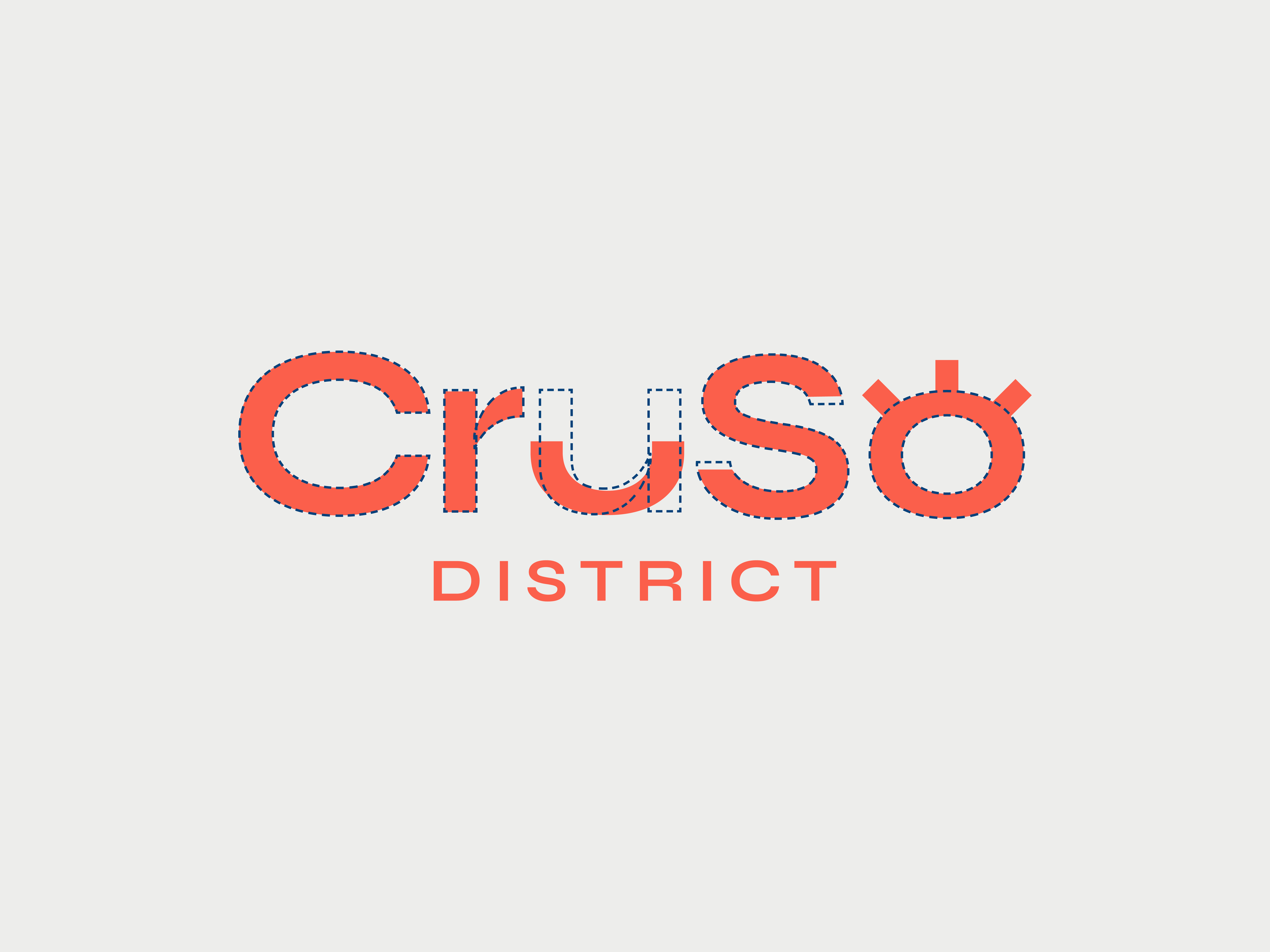
Cruso District: Oval
This was the final chosen logo for a district in Oklahoma, but a name change brought us back to the drawing board, and the following logo was scrapped. The district was to be built around a hospital that was in the shape of an oval. I used the shape of the building and applied it to the 'c' and the 'o' of the logo, while using bright, energetic colors to bring some life to the district.
Cruso District: Wink
This was one of the unchosen logos for the same district. The goals were to appeal to a younger generation looking to settle in the district, lean feminine, and to utilize trendy graphic styles. This particular concept came from the idea of a wink.
The city surrounding the district was supposedly founded with a simple wink. In 1940, a real estate developer went door to door in an area that was mostly farmland, searching for where the government was building its secret airbase. After asking many residents, one finally gave him the answer he needed: a wink. Thus, the city was born.
This logo was intended to bring a revitalized feel to the city’s historical story.
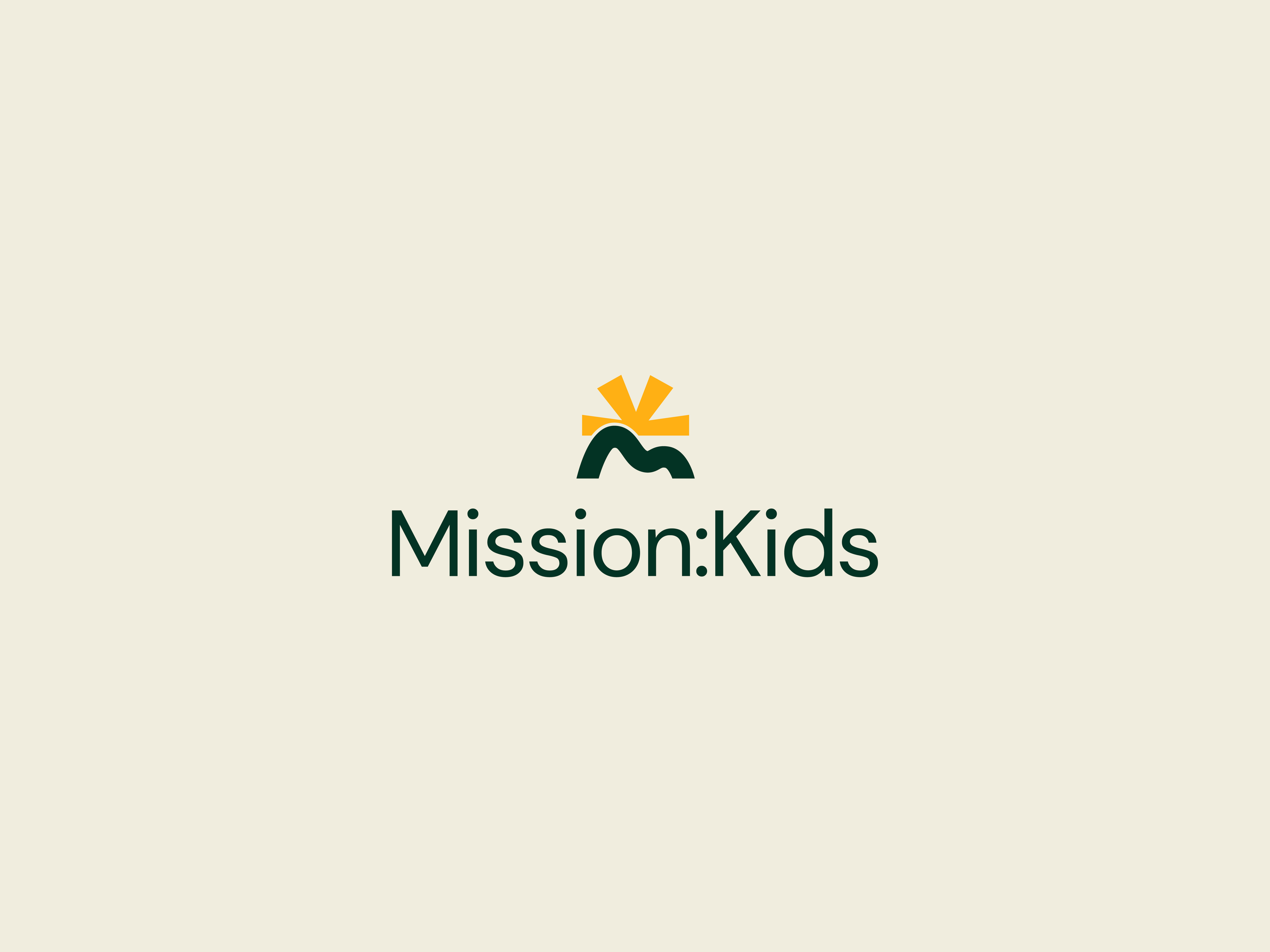
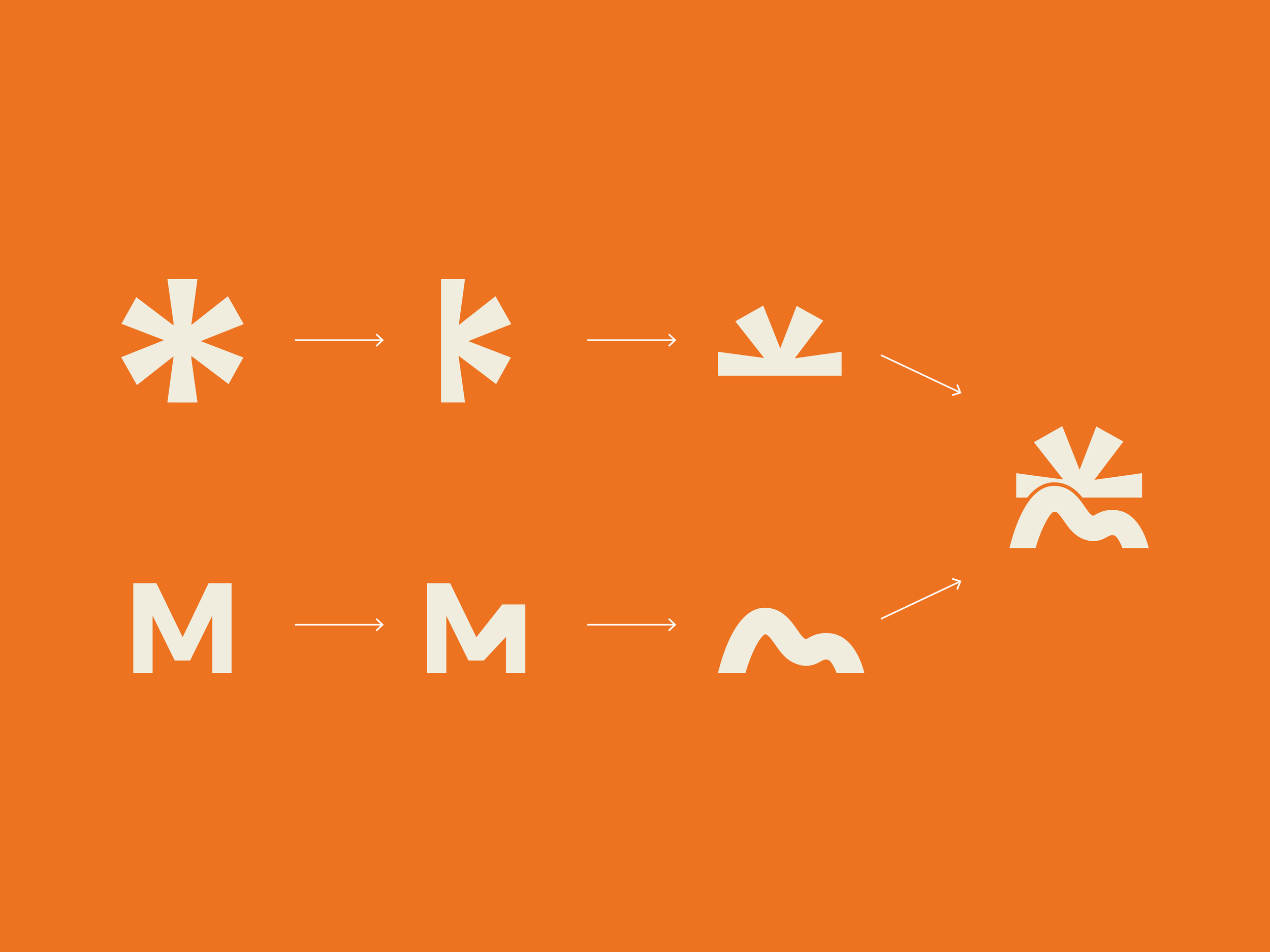
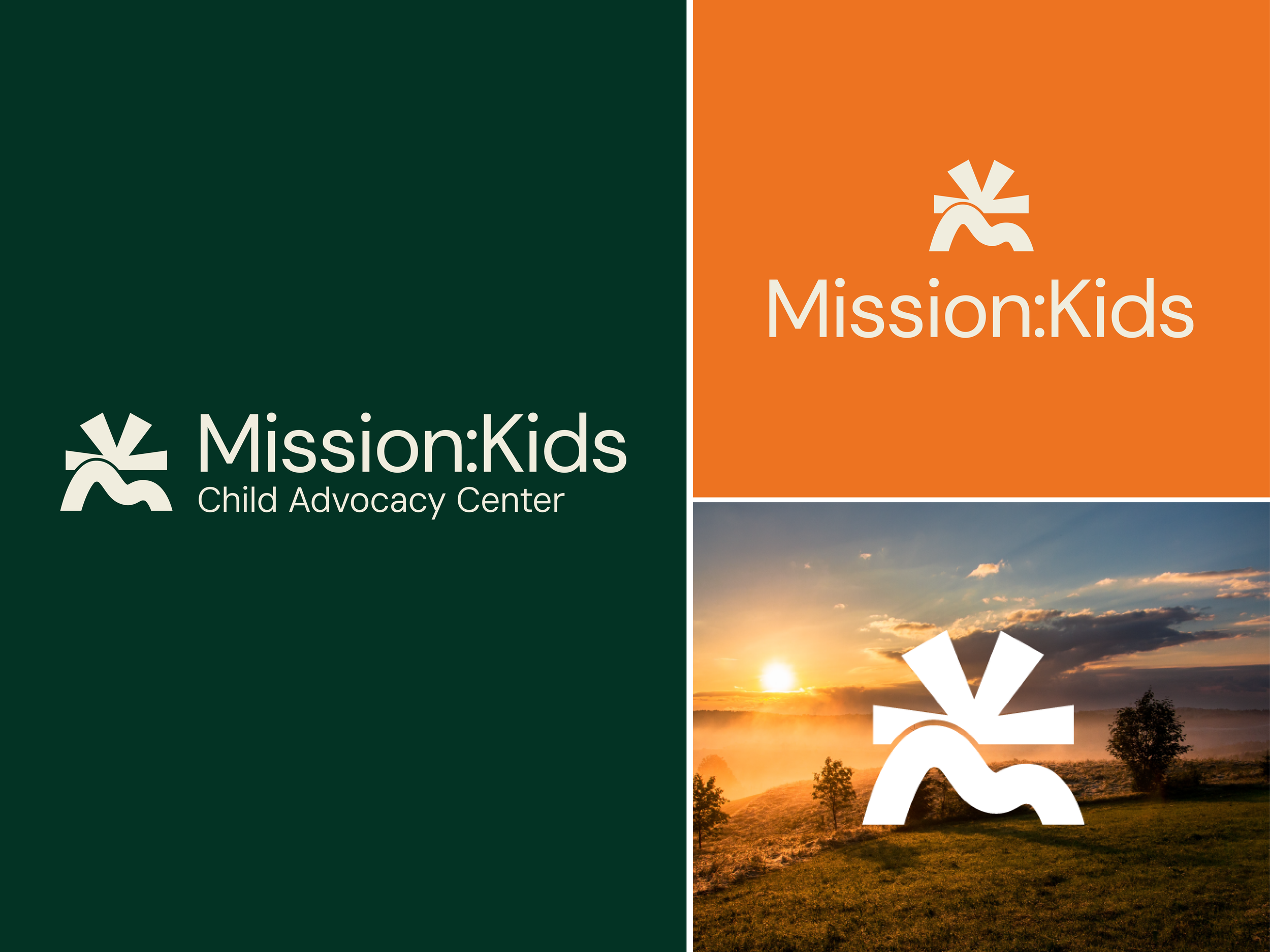
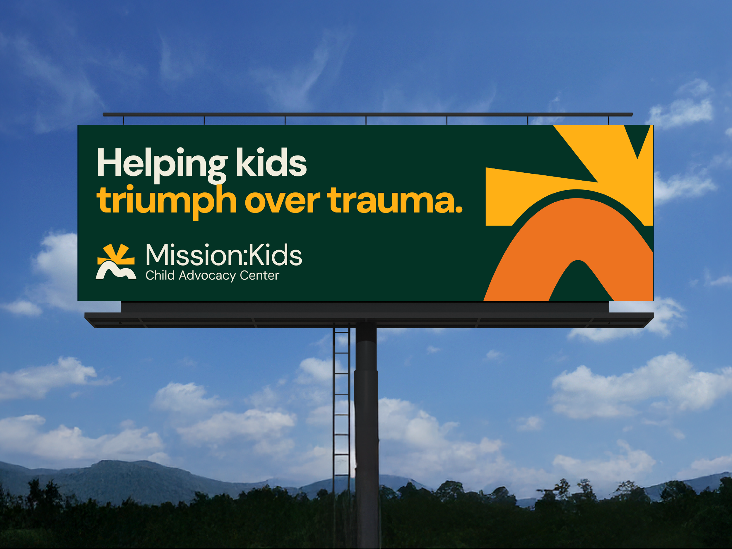
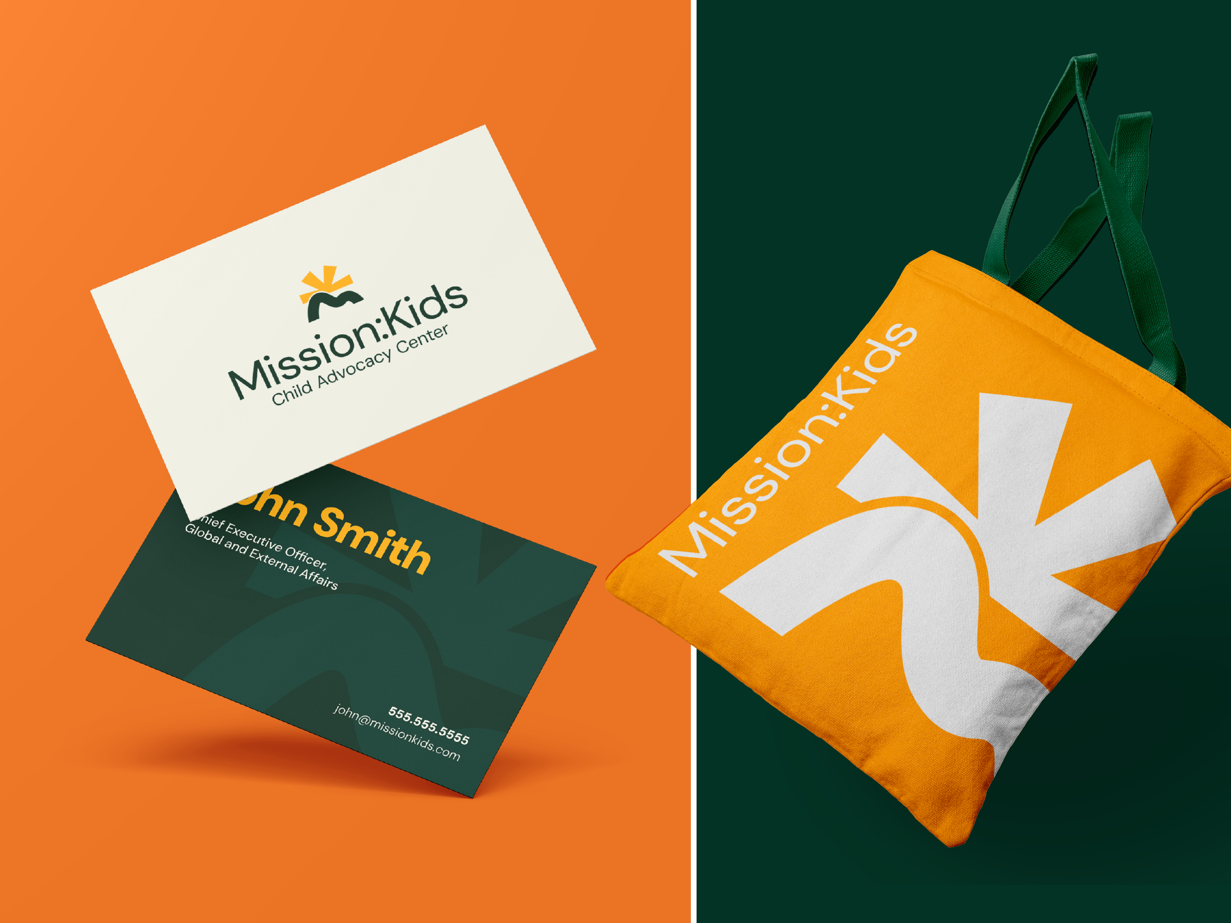
This was an unused concept for a child advocacy center. They specialize in helping children of abuse get the help they need, and begin to heal. The idea came from Mission Kids being a light, and a beacon of hope for kids. For the icon, the 'M' of 'Mission' became the hills, and the 'K' of 'Kids' was built from an asterisk in the brand font - DM Sans, and was to be the sun/beacon atop the hills.
Copy in billboard written by Macy Muirhead.
Mission: Kids
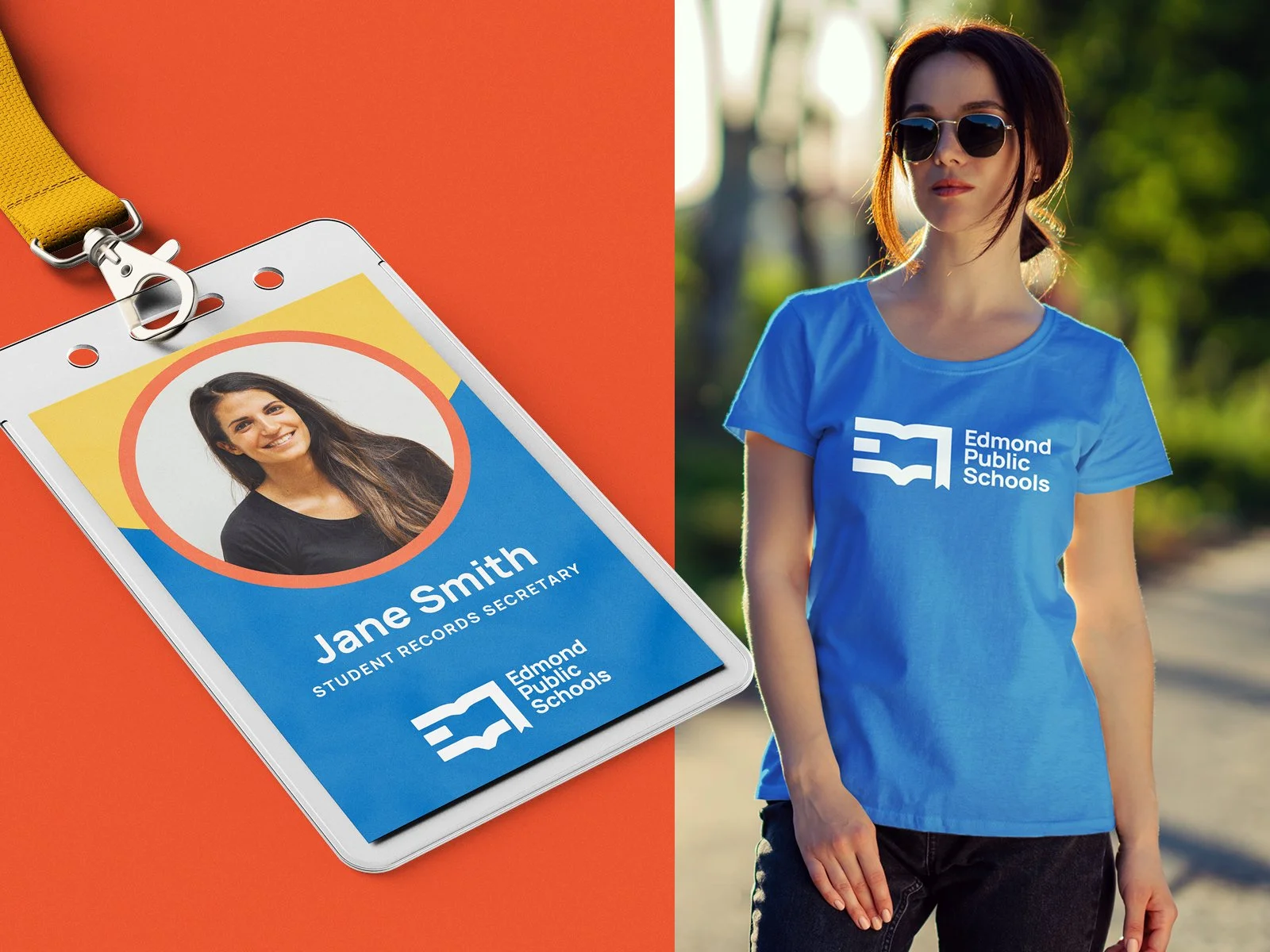
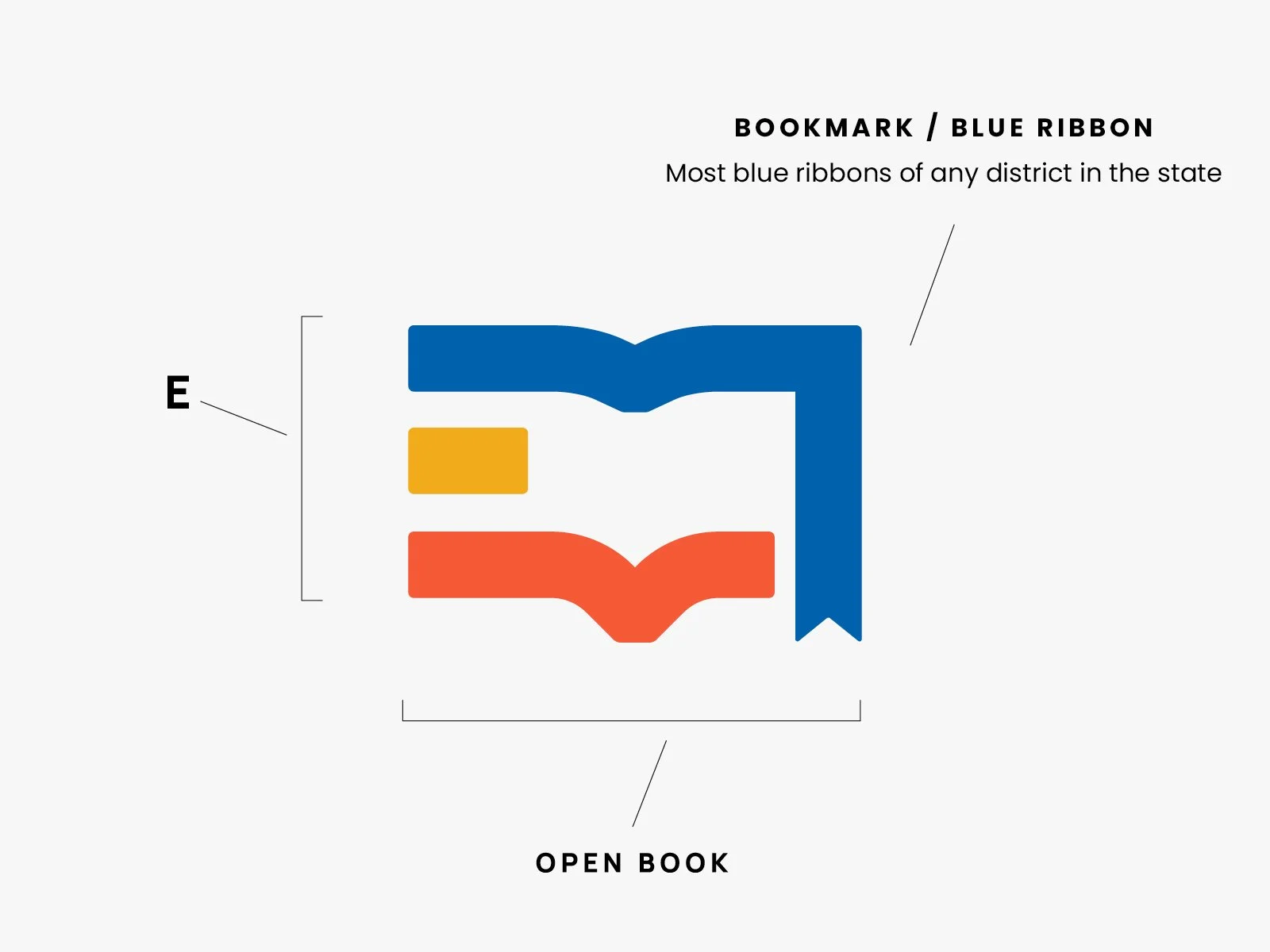
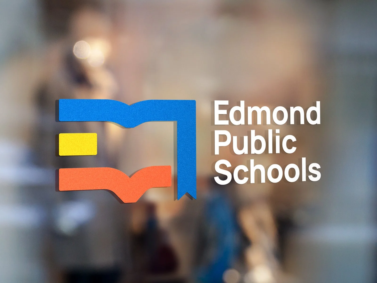
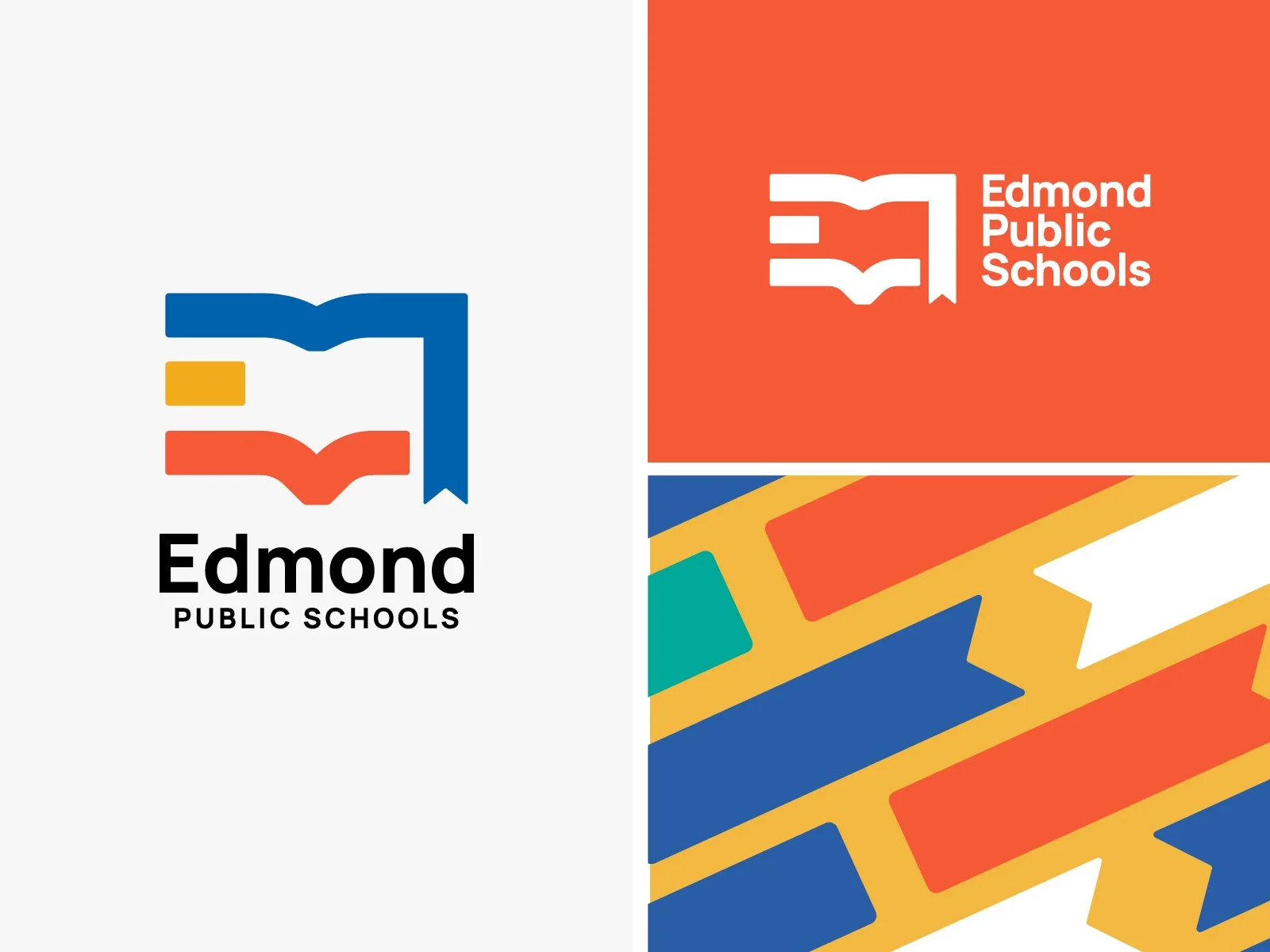
Edmond Public Schools
This was an unused logo for a public school district. This logo concept combined the shape of an "E" with a book, and a bookmark that resembled a blue ribbon (the school district was awarded the most blue ribbons in the state). The colors were to be bright, and youthful, but appeal to most ages in the school district.
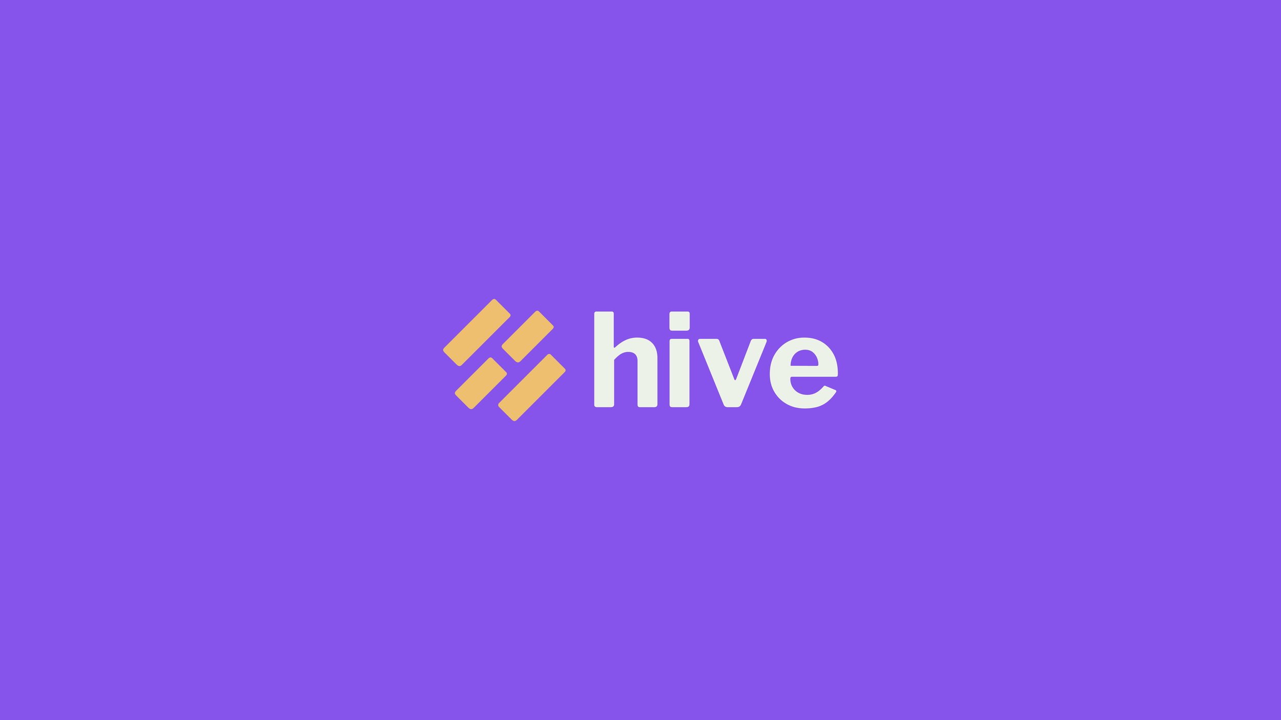
Hive
This was an unused logo for a sexual health advocacy organization that oversaw many other local organizations. The final name became “Honestly,” but this was one of the initial names we experimented with.
The name "Hive" was to signify the multiple entities of this nonprofit coming together to work towards a singular goal. I took the name and played of this idea of a beehive, and the letter "H."
The icon combines the shape of the letter ‘H’ with a simplified honeycomb pattern represented by shapes in Libre Franklin’s characters.

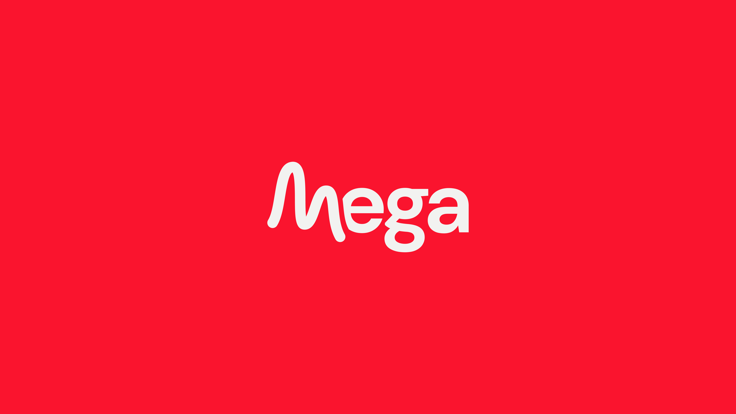
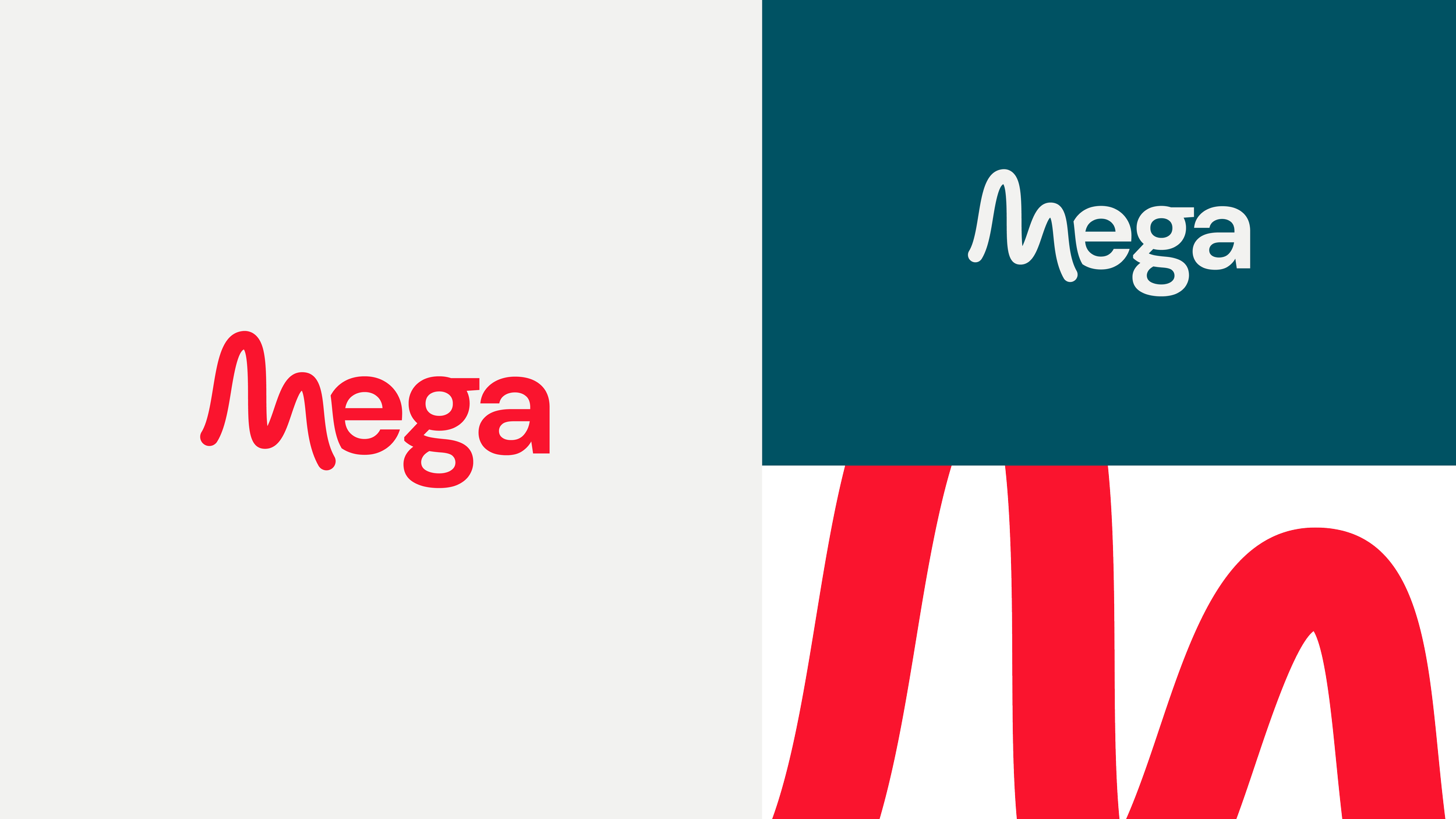
Mega
Another option for name and logo for the youth advocate center that became Honestly. The "m" was to mimic a sound wave, and the importance of speaking out and making your voice heard. The colors were bold and clear, but also youthful and bright.
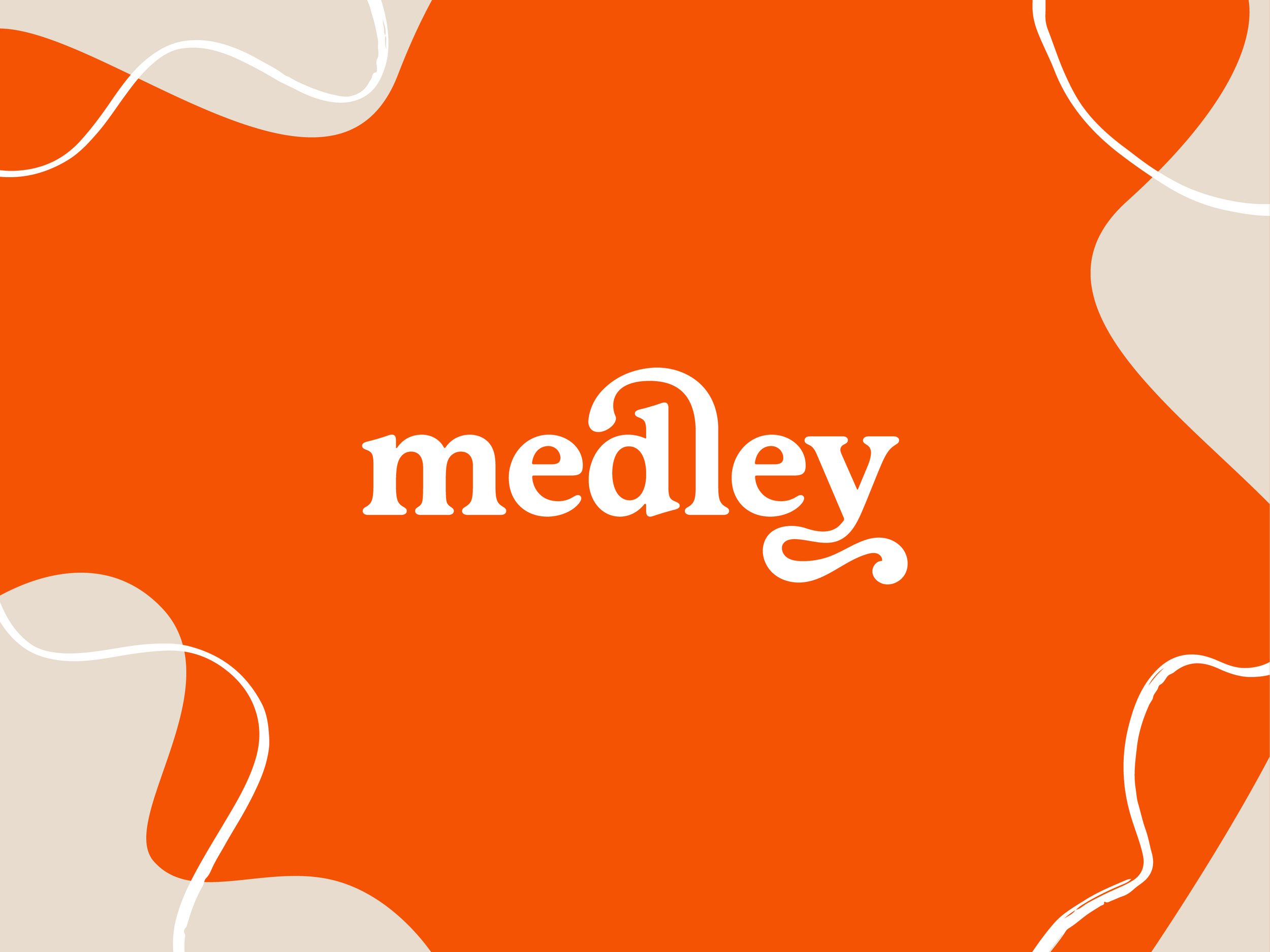
Medley
Another name and option for the youth advocate center that became Honestly. This one was to seem friendly and welcoming to the youth, while using bold reds, and funky, organic shapes to convey the concept of a musical medley.
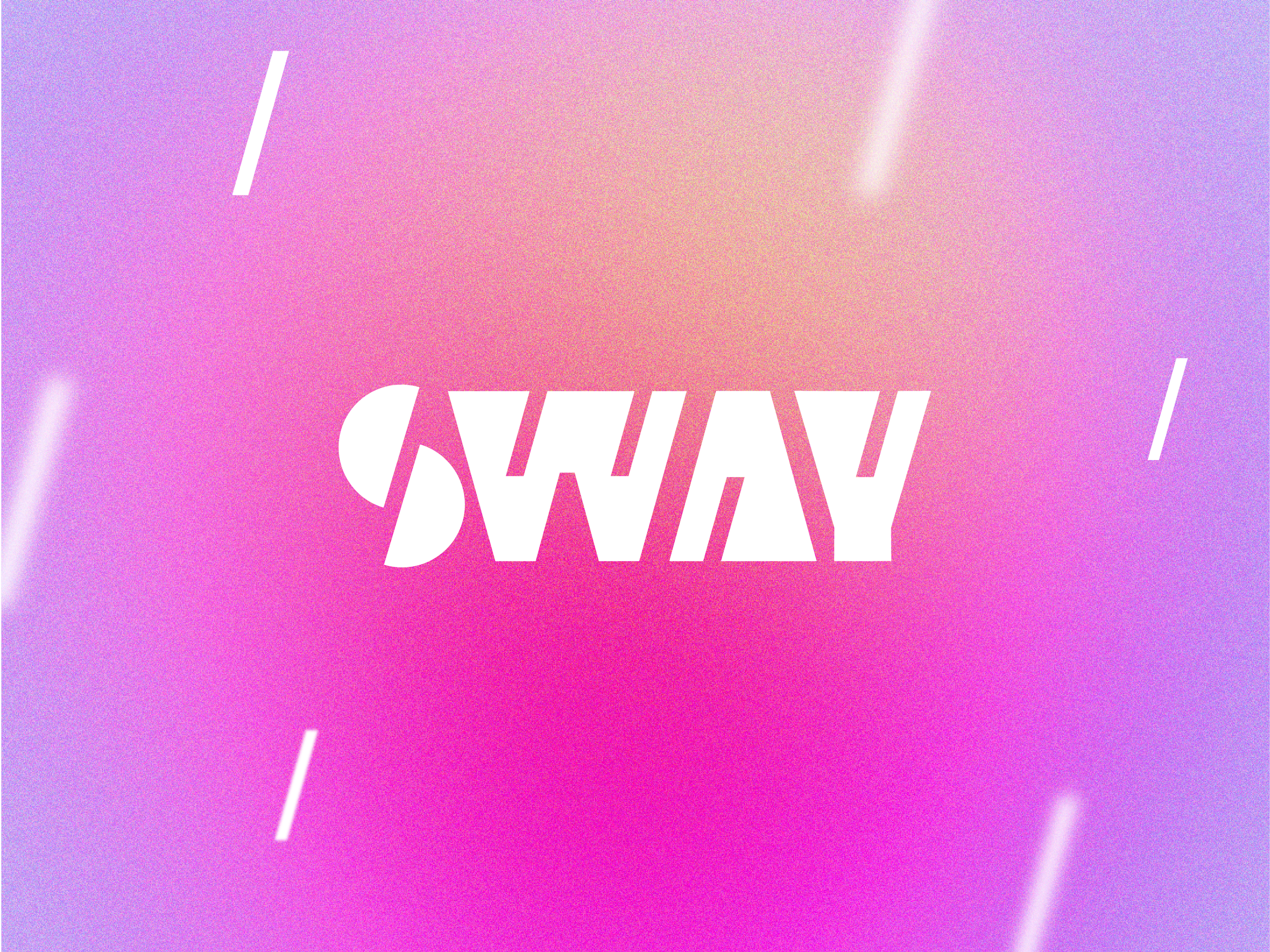
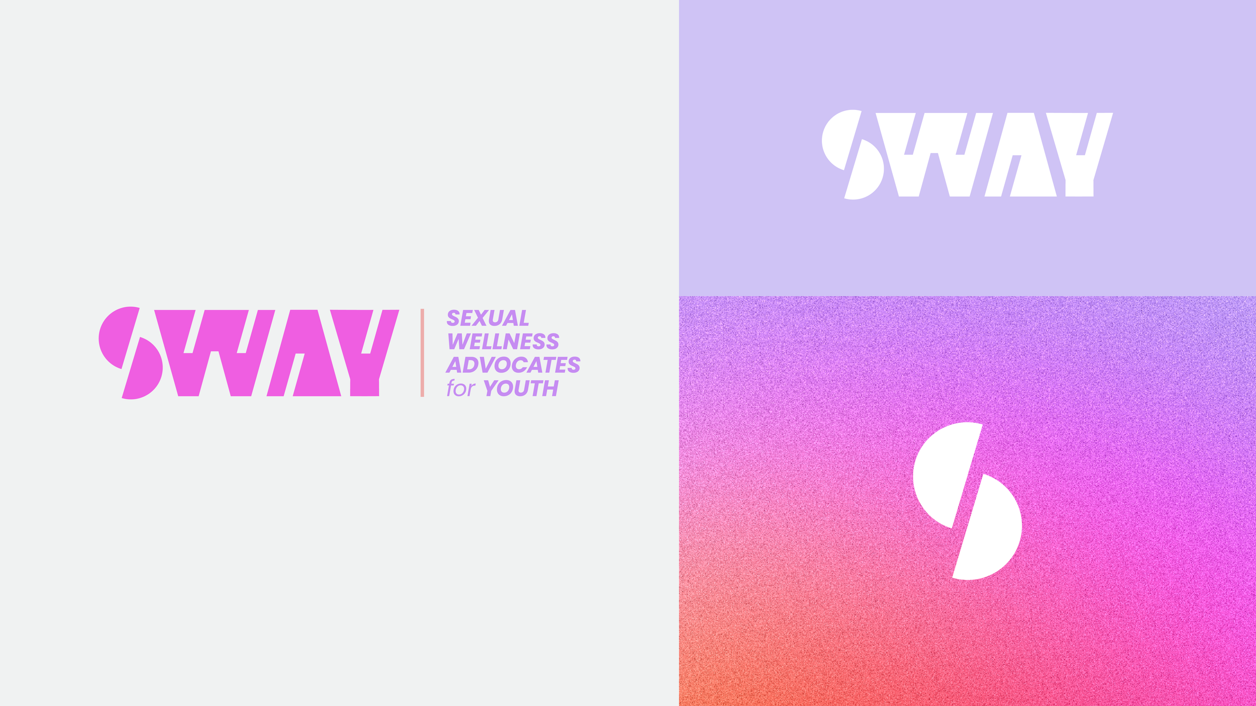
Sway
Another name and option for the youth advocate center that became Honestly. The idea was to sway the conversation, and appeal to a youthful generation. Every angle in the logo is exactly the same.